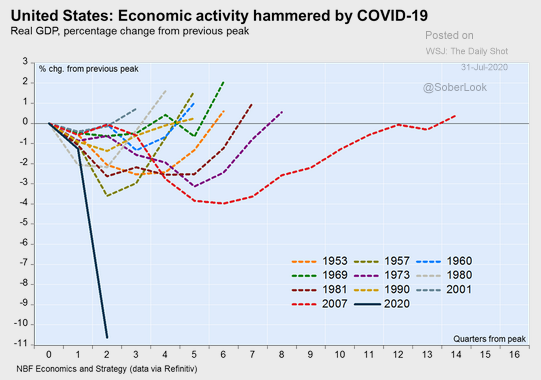
There has been a lot of misinformation about the economy, making things look a lot worse than they are – and then there is THIS chart, but more on that in a moment.

GDP or Gross Domestic Product is reported quarterly by the U.S. Dept. of Commerce’s Bureau of Economic Analysis. Typically this is reported net of inflation and ANNUALIZED. Under present circumstances this is REALLY misleading.
While the headline GDP number for Q2-2020 was -32.9%, that is an annualized figure. For the quarter, the economy contracted -9.5%, still a stunning number. The annualized figure would result if the economy continued to contract at the rate it did for Q2-2020 over the next 3 quarters. That would be HIGHLY unlikely. Most economists are expecting a big rebound for Q3-2020.
The reason that GDP is reported on an annualized basis is to allow easy comparison with prior periods of time. Our chart is another way to visually present the severity of our present decline, in comparison with past recessions.
Note that the solid black line that is almost vertical represents our present downturn. It is unlike anything we have seen in prior contractions. It is for this reason that it is imperative for the Trump Administration and lawmakers to strike a deal to continue to support the economy, until such time as most Americans are vaccinated.
The stock market may give the impression that all is well. The impact of massive Fed stimulus will tend to do that for markets. Our chart shows that the economy is in a very deep hole, and will require government backed stimulus for the foreseeable future in order to avoid permanent damage to America’s job force, and the greater economy.
Contact us if you’re looking for financial planning help!
Deprecated: preg_replace(): Passing null to parameter #3 ($subject) of type array|string is deprecated in /home/ogorek_dev_minerva/ogorek.minervawddev.com/wp-includes/kses.php on line 1805
PLEASE SEE IMPORTANT DISCLOSURE INFORMATION HERE.


